UX Case Study: Krealogi Apps
November 10, 2021
Disclaimer This project is part of the UI/UX Training Program held by the Ministry of Communication and Information with Skilvul (https://skilvul.com/) and (Krealogi) as Challenge Partners. I am not employed or bound by a professional contract by (Krealogi).
In the midst of the digitalization era, the empowerment of crafting industry especially UMKM (Usaha Mikro, Kecil, dan Menengah) in Indonesia is one of the aspects that should be improve. One of the obstacles that our crafting industrial facing is production management, also delivery to inventory process. The level of demand and the number of crafter that can not be accommodated in manual system become one of the reason Du Anyam created an Application named Krealogi which help Crafter Entrepreneur manage their business.
Using this apps, user expected can easily develop their business by improving their operational management digitally. Krealogi apps offer complete solution start from building entrepreneur community for networking until helping record operational activities such as managing and checking orders, production, costs and stock.
Objective
The purpose of making this UX study case is Krealogi requires a user friendly application design that can help Krealogi users to record their operational activities, create strategies and maintain their operational flow.
The objects of this apps are:
- UMKM Kriya Entrepreneur
- UMKM Kriya Entrepreneur Community
Roles On Team
In this project making prototype for Krealogi apps, I collaborated with 2 others team members, named:
- Brian Nova Prathama in Simple Cash Flow
- Danny Steven in Warehouse and Stock Management
- Andina S Putri (Me) in Simple CRM
Design Process
In this case, we choose to use Design Thinking as our design process approach. Design thinking is the process of creating new and innovative ideas that can solve problems. It is not limited to a particular industry or area of expertise.
Define
After analyzing the needs of crafting industries, we conclude the pain points as follows:
- Direct and Indirect Finance Menu features are difficult to use
- Users do not know what products are often purchased by certain customers, so it is difficult to predict the trend of products that must be produced
- It is difficult to know the stock of production and raw materials
- From the existing Krealogi apps, there is no periodic sales data that can be drawn to find out the purchase history.
Ideate
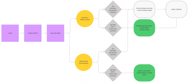
As the results of our discussion after trying existing Krealogi apps, we made the ‘How Might We’ — ‘Solution Idea’ — ‘Prioritization Idea’ stages, we managed to create three user flows from features included in the pain points.
 |
Analytics Menu |
 |
| Warehouse Management |
 |
| Purchase History |
Design and Prototype
The UX/UI Designer team creates alternative designs which will be best to use.
Wireframing
Wireframes are made using pen and paper. We use Crazy 8's method.
 |
| Crazy Eight's Design A |
 |
| Crazy Eight's Design B |
 |
| Crazy Eight's Design C |
High-Fidelity Design
High-fidelity design created using Figma
Prototype
The prototype was created using Figma. The complete design and prototype can be seen at the following link:
- Krealogi Design Prototype: https://bit.ly/3GgjXfb
Usability testing
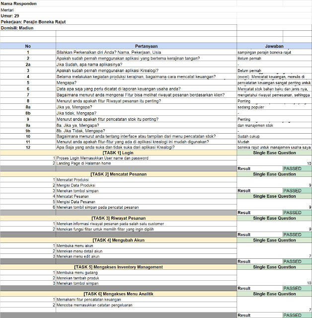
Usability testing is done by the UX research team to find out usability problems that may exist in the prototype design. The following picture is the results of usability testing with one of our respondents, a knitting doll craft entrepreneur.
Conclusion
After going through research and prototyping by adding new features, the prototype of Krealogi apps is easier for users to use.


0 comments